|
I learned about L cuts and J cuts when it can to manipulating video effects, more specifically when it came to using them for transitioning audio with scenes, I also effectively used freeze frames which are not my favorite but i don't have anything against them either
Nothing was particularly hard, i did like the captions tool even though it was tiring to use and copy it to keep using it. when it comes to effects to manipulate audio and video clips it helps make the video look cleaner and a lot more professional, it wasn't hard exactly either.
0 Comments
I tried to line up the timing of each clip, like with the zoom in of the cup at the very beginning to it transitioning to the guy picking it up to drink, you can't really achieve that with basic images.
It was really easy to time the clips since we were given extra time, however it took me a bit to figure out how to use an existing audio from another clip ontop of another. The app on my phone allows you to extract an audio from a video clip and then get rid of the video while keeping the audio, for this program i had to layer the video on top of the other and then hide the actual footage with the eye toggle on the side. i'm for sure getting better at learning the program, the visual toggle tool with layer videos is quite handy instead of just straight up deleting the video, although i wonder if that would become a problem down the road with layering too much and the prograqm glitching out.
Throughout this quarter, I've delved deeper into the realm of graphic design, particularly sharpening my skills in Adobe Illustrator. Understanding the nuances of Adobe Illustrator, especially in contrast to Adobe Photoshop, has been enlightening. I've grasped the intricacies of vector graphics and honed my proficiency in utilizing fundamental tools like the Pen, Text, Shape, and Gradient tools. These skills have not only broadened my technical expertise but also enhanced my ability to translate ideas into visually appealing designs efficiently. My skills have undergone notable growth, particularly in the realm of creating intricate designs using simplistic shapes. Embracing the ethos of "less is more," I've learned to wield a minimalistic approach to design, achieving visually striking outcomes with fewer elements. Additionally, I've become adept at leveraging a select few tools to execute complex projects, a testament to my evolving proficiency in Adobe Illustrator and graphic design principles. While I've enjoyed the Adobe Illustrator projects, I encountered a significant challenge with the tank graphics project. This endeavor pushed me out of my comfort zone, necessitating multiple revisions and remakes of the model to produce a suitable unwrap template for painting in 3D Max. Despite the hurdles faced, this project served as a valuable learning experience, highlighting areas for improvement and fostering resilience in overcoming obstacles. Looking ahead to the next portfolio check, I'm committed to continuous growth and improvement. I intend to optimize my time management skills further, recognizing the importance of efficiency in project execution. Additionally, anticipating a shift towards more 3D-related programs, I aim to broaden my skill set by familiarizing myself with these tools, ensuring I remain adaptable and proficient in an evolving landscape of design technologies. By embracing these strategies, I'm confident in my ability to elevate my work and continue advancing as a graphic designer. I can DEFIANTLY see myself using illustrator in the future, as it was one of my plans to create sticker and KEY CHAIN designs as a side job to my FUTURE FORENSICS career. 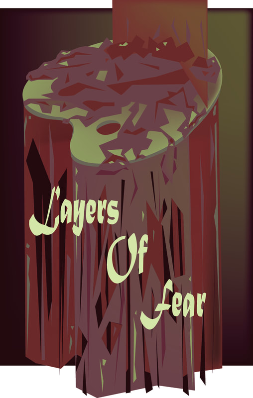 I decided to base my movie poster on the game "layers of fear" which is a horror game regarding layers of mysteries and of course paintings and painters. I chose more of a maroon color and yellow green color to help add to that creepy and dead decaying feeling, to unease people. I mostly used the pen tool because of how easy it is to use to create organic shapes. I started out by wanting to create a pallet, because the game focuses on painting I thought it would be APPROPRIATE, and then i decided that instead of paint, to give a creepy vibe to it, i added in blood that's overflowing the pallet.
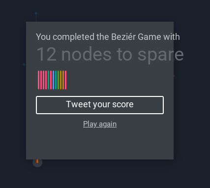 It did help a lot with helping me learn the mechanics of how the tool operates. i did the game about 3 times to get used to it and also to see how many nodes i could spare.
This activity for sure pushed my creativity and the uses of the tool in order to successfully create the many rounded corners these starwars logos encapsulate a lot. It was overall a very fun activity that helped me become more creative and comfortable with using the tool.
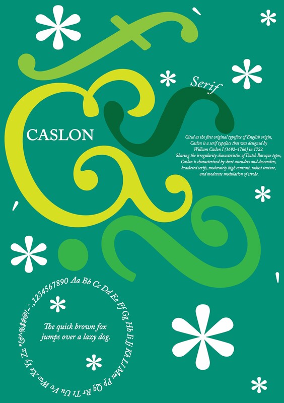 As mentioned in my type specimen, It is one of, if not the, first original typeface of english orgin. Caslon is a serif typeface that was designed by William Caslon I (1692-1766) in 1722. sharing the irregularity characteristics of dutch baroque types, caslon is characterized by short ascenders and decenders, bracketed serifs, moderately high contrast, robust texture, and moderate modulation of stroke. It was actually even commonly used in very young newly established US, seen on important historical documents. I chose it because i typically use it sometimes when i do school presentations, it tends to go nice with lighter and simple colors, while not looking too complicating but also not as boring like other fonts, such as times new roman font.
|
AuthorI'm 'Line Greenberg! I am currently a Junior at Chapel Hill Highschool for the 2023-2024 school year. Archives
May 2024
Categories |
 RSS Feed
